There is a version of this article you have read a dozen times already. It has a chart. Blue means trust. Red means urgency. Green means health and money. Yellow means optimism, unless it means caution. Purple means luxury, unless it means creativity. Somewhere near the top there is a statistic claiming colour increases brand recognition by 80 percent.
That statistic is worth pausing on, because it tells you most of what you need to know about this field. It gets attributed to a researcher at Loyola University Maryland, and it has been repeated for well over a decade. When people have gone looking for the original study, what turns up doesn’t say what the quote claims. The likely original finding was far narrower and much less exciting: colour beats black and white for memorability. Which is true, and obvious, and says nothing whatsoever about whether your logo should be teal.
So let’s do this differently. Here is what the research genuinely supports about colour and branding, what it doesn’t, and how to actually choose colours for a logo and a website without guessing.
Colour doesn’t carry meaning. It carries associations.
The single most useful reframe: colours don’t have inherent psychological properties. They have learned associations, and those associations come from everything you have ever seen that colour attached to.
Red doesn’t create urgency. Red has been used on sale tags, warning signs, and stop lights for your entire life, so you have learned to read red as pay attention now. Green isn’t intrinsically natural — it is the colour of the plants outside your window and of the organic aisle at the supermarket. This is associative learning, not biology, and it means colour meaning is contextual, cultural, and changeable.
The most cited academic work here is Labrecque and Milne’s 2012 paper in the Journal of the Academy of Marketing Science, which ran four studies mapping colour onto brand personality dimensions. It found real, measurable relationships — blue tended to signal competence, red tended to signal excitement — and that’s about as close to the popular chart as the evidence gets.
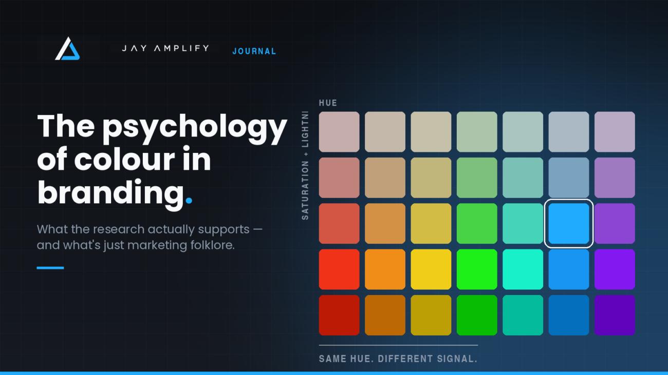
But their more interesting finding gets ignored. It wasn’t just hue that mattered. Saturation and lightness carried as much weight as the colour itself. A muted, desaturated blue and an electric, high-saturation blue do not say the same thing about a business. One reads as institutional and conservative. The other reads as energetic and modern. Same hue. Completely different signal.
If you take one thing from this article, take that. Most people agonise over which colour and then pick a shade at random. The shade is doing at least half the work.
Fit beats theory
The second finding that survives scrutiny is that colour appropriateness matters more than colour preference. Research on logo colour has consistently found that people don’t evaluate a colour in isolation — they evaluate whether it fits the product or category.
Nobody likes the colour of a Caterpillar excavator in the abstract. It works because heavy machinery in that particular yellow reads as industrial, visible, and serious about safety. Put that same yellow on a private wealth manager and it becomes absurd.
This is why the generic colour chart fails. It answers “what does blue mean” when the real question is “what does blue mean for a business like mine, to the people I want to reach.”
The category convention problem
Every industry has a default palette. Finance and healthcare go blue. Law goes navy and burgundy. Sustainability goes green. Trades go navy, red, or fluoro. Tech goes blue, or lately, near-black with one bright accent.
Convention exists because it works — it helps people categorise you instantly, before they read a word. A blue and white medical clinic is legible as a medical clinic in a quarter of a second.
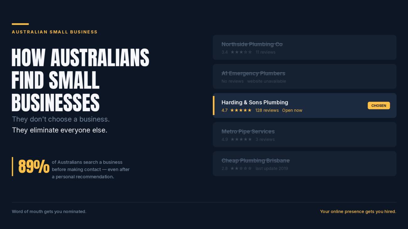
But convention is also why so many small businesses are invisible. If every plumber in your city has a navy and red logo, being the eleventh navy and red logo doesn’t buy you category legibility. It buys you camouflage.
There’s a genuine tension here, and it doesn’t have a universal answer. Roughly:
- If your category is unfamiliar or trust-sensitive, lean toward convention. You need to be understood before you need to be remembered. A new fintech that looks like a nightclub flyer has a credibility problem before it has a differentiation problem.
- If your category is crowded and well-understood, break from it deliberately. Nobody needs help understanding what a coffee shop is. That’s where distinctiveness pays.
The useful move is often to keep the structure conventional and make one deliberate departure — conventional layout and typography, unexpected accent colour. You get legibility and memorability at once.
Culture is not optional
Colour associations vary meaningfully across cultures, and the standard examples get repeated so often they’ve become clichés — white for mourning in parts of East Asia, red as auspicious in China. Cross-national research on colour meaning has found both some consistency and genuine divergence depending on the colour and the association being tested.
For most small businesses serving a local market this is a non-issue. If you sell to one city, design for that city. But if you have any ambition toward export, multicultural customer bases, or international software users, it’s worth a sanity check before you print ten thousand of anything.
Now the practical part
1. Pick a primary, then design the whole system around it
You need more than one colour. A workable minimum:
- One primary — the colour people associate with you. Used on the logo and the major brand moments.
- One or two neutrals — near-black for text, an off-white or light grey for backgrounds. These do most of the actual work on a website.
- One accent — used sparingly, reserved almost exclusively for actions. Buttons, links, the thing you want clicked.
A rough 60/30/10 split — 60 percent neutral, 30 percent secondary, 10 percent accent — keeps things from getting loud. Most amateur brand palettes fail not because the colours are wrong but because there are six of them and none of them are in charge.
2. Reserve your accent colour for one job
This is the highest-leverage rule on this list and almost nobody follows it.
If your call-to-action button is bright blue, nothing else on the page should be bright blue. The moment you use your accent colour for a heading, a decorative icon, a border, and a button, it stops meaning “click this” and starts meaning nothing.
The long-running debate about which button colour converts best — red versus green, and so on — mostly misses the point. What those tests actually demonstrate is contrast. The winning button isn’t the one that’s a particular colour, it’s the one that’s different from everything around it. Colour is the mechanism; distinctiveness is the effect.
3. Test it in greyscale before you commit
Convert your logo to black and white. Does it still read? Are the shapes still distinct?
Research on logo recognition suggests shape and form carry recognition more reliably than colour does. If your logo only works in colour, it will fail on a fax-quality invoice, an embossed business card, a black and white newspaper ad, a vehicle decal, or a favicon at 16 pixels. Colour should enhance recognition, not carry it.
4. Check contrast properly, not by eye
Text needs a contrast ratio of at least 4.5:1 against its background to meet WCAG AA, or 3:1 for large text. Use a free contrast checker — there are several online, and most design tools now have one built in.
This is not a box-ticking exercise. Roughly one in twelve men has some form of colour vision deficiency, most commonly red-green. Add everyone reading your site in direct sunlight on a phone, everyone over fifty, and everyone with a cheap monitor, and low-contrast text is quietly costing you a meaningful share of your audience. Light grey text on a white background is the single most common self-inflicted wound in modern web design.
Also check your palette against a colour-blindness simulator. If your only signal for “success” versus “error” is green versus red, a significant number of people can’t read it. Pair colour with an icon or a label.
5. Consistency beats optimisation
Here’s the uncomfortable truth about all of this: the specific colour you choose matters far less than using it relentlessly and consistently for years.
Colour becomes a brand asset through repetition. Cadbury’s purple, Tiffany’s blue, Coca-Cola’s red — none of those colours were psychologically destined for those products. They became meaningful because those companies used them without deviation for decades until the association calcified.
You will not get that from a perfect colour choice. You get it from picking something defensible and then never quietly drifting — a slightly different blue on the van, a different one on the website, another on the invoice template.
Write the hex codes down. Put them somewhere you’ll find them. Use them everywhere.